In part 1 of the draft preview, we did a deep dive on the NCAA stats and came up with some innovative tools. In part 2, we did the same with the Euro and DLeague stats. In Part 3, we will come to a denounment and give draft recommendations for every player.
This isn't that post.
When I write one of these pieces that pushes the limits of what I do, a lot more work than what actually gets in the piece gets done. A lot of good work that just doesn't quite fit. It doesn't match the narrative. It's a bit redundant. It makes the piece too long. Much like a director, I get to butcher my creation for the good of the whole.
I do have the ability, like a director, to share this content at a later date. This then is the deleted scenes for this year's draft preview.
We'll start with a breakdown of player rating by population group for the NCAA.
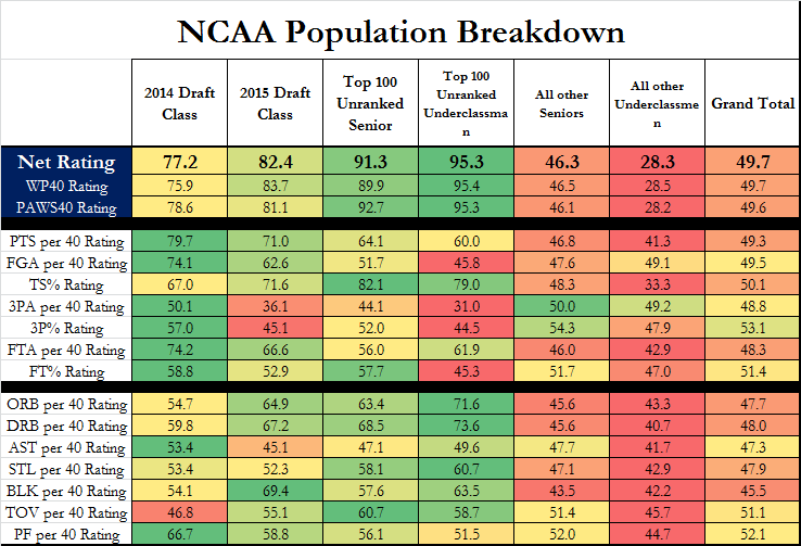
This is a fun graph meant to illustrate the difference and relative strength of the draft groups. Of note is that both the 2014 and 2015 projected draft classes are the top groups for Points per 40 minutes and for usage per 40 minutes. The top unranked senior and underclassmen are tops in True Shooting %. Three Point Shooting % and Attempts also seems to correlate to draft stock as well. Prospects take note!
A second fun graph is this:
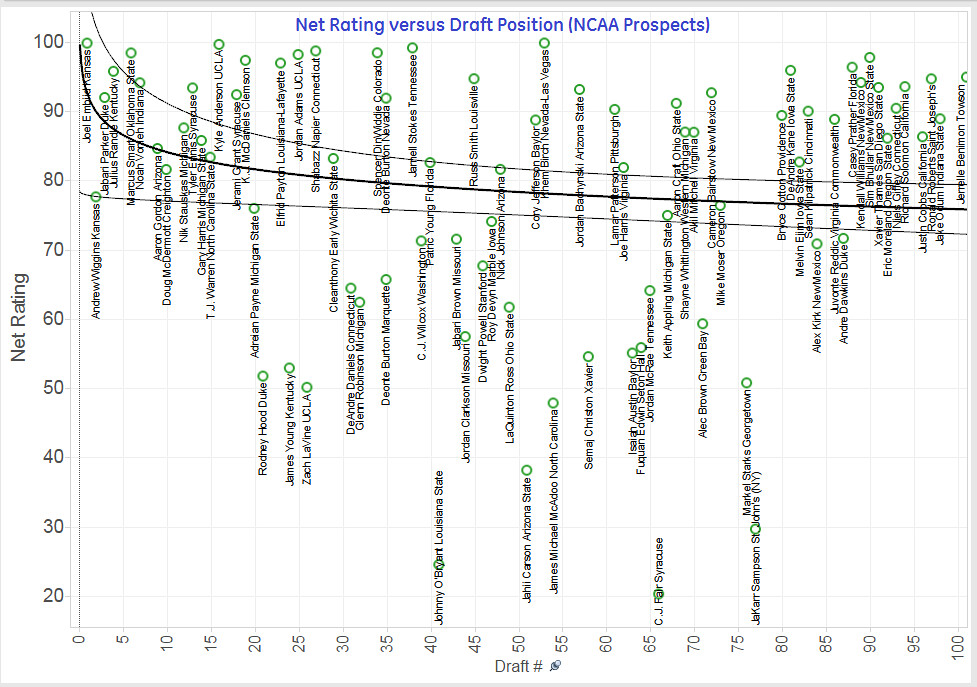
That's Player net rating versus draft ranking as per draft Express for all NCAA prospects. The simple way to read this is that if the player you select is over the black line you're getting value (Smart, Randle, Anderson, Birch), below the line and you're drafting a risky proposition (Rodney Hood, James Young, Zach Levine). I like it.
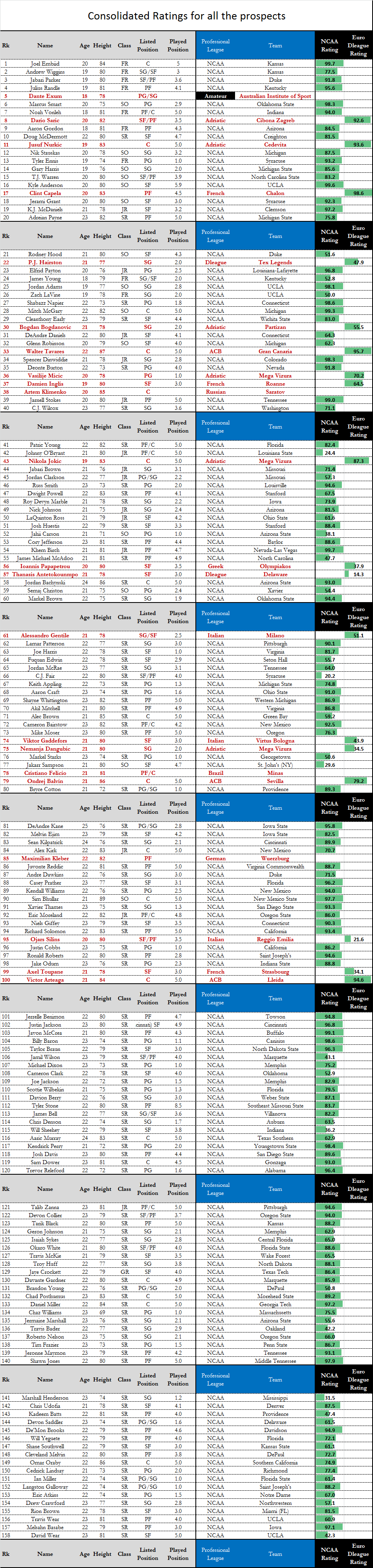
The final graph I leave you with is a summary of all player ratings for all ranked prospects.
-Arturo